Loading Responsive images or modern way should be an important consideration when designing or considering a new website. The key focus is creating a great user experience. One of the key things to consider is the speed of your website.
Website speed can either make or break your ranking in Google. This is part of Google’s algorithm called Google Core Vitals – it focuses on the whole experience from how fast the site is, to how fast someone interacts with the site and how fast the largest elements of your site load etc.
When deep diving into the tools Google provides called Google Lighthouse, this shows the reasons why the speed score is the way it is.
There are many reasons why the speed is affected, but let’s focus on the best practices initially- images for example are a classic for people uploading massive images that don’t have any resolution considerations or what device the image is loading on.
Its likely to see Images not being sized correctly dependant how your website is built.
Responsive images
Years ago, we used to have responsive images meaning regardless of desktop or mobile, we used one image that would respond appropriately to the screen using a max-width:100%, and other CSS that would make it look good on mobile, but even though we still use CSS to control the image perspective it’s not enough nowadays. We used to use one image for all viewport(device/screen) sizes, which leads to serving too larger images to a mobile device that is tailored for a desktop, and as Google is now and has been for some time a mobile first algorithm – this old way of working is going to affect a users experience.
Modern approach responsive image loading
Let’s delve into the following more closely, Firstly avoid using the following:
- Large images that are not compressed
- Uploading one image for all devices
- Always using jpg or png thinking it’s ok – choose modern image types.
- Loading massive images in the background.
Large uncompressed images
Loading non compressed images will lead to higher load on your website unnecessarily, hence will affect your users experience. Its easy to compress image sizes using common image tools, or you can use free online tools to compress images.
Taking that step will at least reduce your images for the web and make the image loading time reduced.
One image for all devices
Many years prior, the common one image fits all approach was common, but we have to consider mobile first is the focus nowadays with so many people using mobile devices, so we have to think of them separately, one for a mobile and one image for a desktop. The goal is to provide a user with the image required based on what device they are on.
On desktop we can offer a larger image and a wider image where as on a mobile your design team or designer might want a completely different image for the smaller mobile viewport, so without consideration of new ways of working, you would cause the following issues.
- Loading delays in serving the wrong image size
- User experience affected by delays in page loading times.
- Google algorithm frowning on the site through not compliance with the modern standards and UX problems.
Choosing an image type
There are many image types to choose from, and it doesnt always need a JPG for everything, but ask yourself the following
- What is the purpose of the image – to show a great picture or to show a good illustration
- Do I need transparency in the background
- Do I really need top quality or can I compromise the quality a little for a smaller size image?
These questions will dictate the image type, for example, JPG is good output for photos and image compression is good, but PNG is larger size for transparent images. This is where we have a better solution – WebP.
WebP images
There is an all round solution, which is WebP. This image type is an all-round winner as it’s not just great quality output but transparent, and designed to be fast for the compression flexibility. Compression for WebPcan be lossy or lossless. As mentioned in https://developers.google.com/speed/webp/docs/compression the compression makes around 30% saving compared to PNG and JPG.
Lossless compression
This uses encoding that the size is not reconstructed as lossless is, and retains a better image quality that lossy.
Lossy
Can be compressed for a smaller file size, but depending on the level of compression, the image can be visibly reduced in quality, so a balance of file size and quality is needed. Lossy images are
up to 34% smaller than JPG files.
If you replace PNG images that are lossy plus alpha, you can gain up to 70% better compression than PNG images.
Background images
Background images are great, but when testing this through Google lighthouse speed test, the Google core vitals clearly highlights a problem when trying to reduce the LCP (Largest contentful paint) which is the largest visible element on the page.
We have no control over this with offscreen background images, and less control from a loading and page load perspective. If we look at the waterfall load on the site, we can see background images queue to load on the page first, so this then generally gets picked up as the LCP on the page, which we have to avoid.
Background images have no control over the following
- Cannot attribute async to load these images
- Cannot add a fetch priority attribute
- Can’t lazy load the images
- Can’t set a width and height attribute
- Can’t add an alt attribute
To fix this:
We need to come away from background images on hero sections and replace with a physical
We have to set a height and width for responsive images but we can use the following code to load the image in the correct viewport, using either img srcset or the picture element.
Both img srcset and picture elements work a similar way in serving various resolutions for each desired image load, for example, to load one image for small, medium and large images on different viewports.
Img srcset
This modern approach to loading images loads the desired image based on what viewport size it’s displaying, therefore it’s serving a correctly sized image on various image size resolutions that are either 1x(mobile), 1.5x(tablet) or 2x(desktop). So we can serve different images per screen size.

Picture image
If you’re needing art direction in tailoring specific picture responsive images per viewport, then picture elements are great at switching images without a page reload, as from experience the picture element is smoother in switching viewport images if changing.
This uses a source for each image variation that you can set media queries on, meaning you can set the min or max width for the image. You need an img tag, then you choose which image sizes you want to switch too for the viewports. This is a better solution for more dynamic browser resizing, but still works similar to img srcset.

Picture and img src set image loading
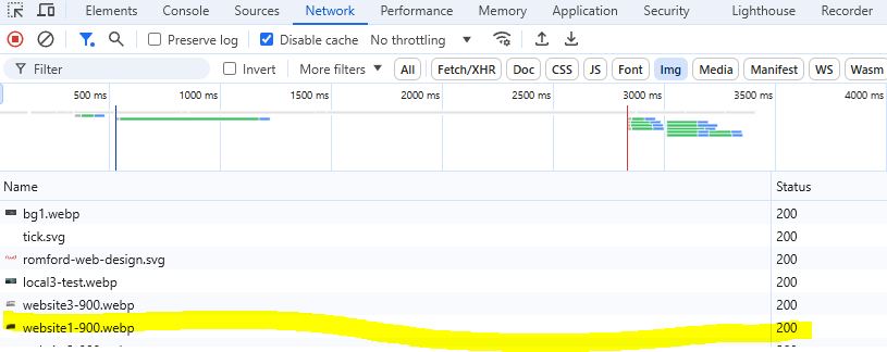
On any browser you have tools built in that shows what is loading on page load. Using these modern techniques, we can see why Google likes this, with reasons being
- Loading only the image we need, whether desktop, tablet or mobile
- Serve the correct size image for the user
- Improves performance
We can see from this screenshot that the image only loads dynamically based on what device we are using it on, so here we can see on desktop it loads the 900 width image
Larger loaded image
This is loading a larger image dynamically based on the desktop viewport.

Smaller loaded image
This is loading a smaller image dynamically based on the mobile viewport.

